
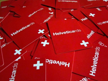
Helveticards
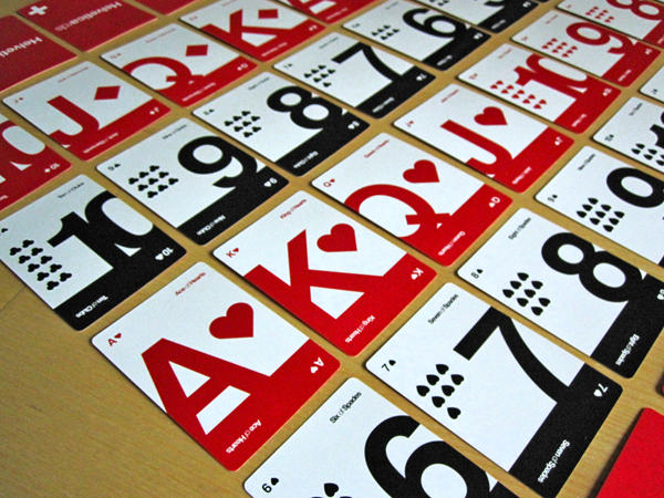
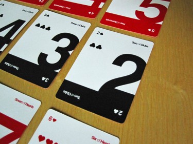
The Ferocious team loves to see designers who are passionate about a concept, and then package it up and make it available to design geeks like us. So props to designer Ryan Meyers of UD+M for designing a really sweet deck of Helvetica-themed playing cards. This deck has a really sharp aesthetic to them, with high quality printing they are printed on a totally durable, usable glossy coated stock. I particularly love the way the Two and Three card of each suit are cropped — something stunning about those forms typeset in Helvetica.
 I do wish the face cards had a little more oomph than just a change of justification, though. Perhaps a different type treatment? Maybe a large icon of the suit with the letter reversed out? Better yet, an illustration that pays homage to the International Style perhaps? (I bet someone on the Ferocious team would love to collaborate on that.) Of course, that’s just a mild criticism. It’s clear there was a desire for consisten simplicity and restraint, and that’s definitely been accomplished. All around, nice design work.
There doesn’t seem to be much commentary (that I could find) from the creator(s) of the cards, though I did find this nice write up over on the It’s Designed blog. Check it out to hear some of the thinking behind the project. Buy the cards here.


2 Responses
Add your comment
You must be logged in to post a comment.
Related posts


Thanks guys. I appreciate all the compliments and the photos are gorgeous!
Cheers,
Ryan
I’m making a deck using Wingbats.