
The Heroes of Folk / Interview with Scotty Reifsnyder
 http://frcio.us/3aUF
If you’ve been anywhere on the tubes of the interweb recently, hopefully you’ve been introduced to the Lancaster, PA based illustrator/designer, Scotty Reifsnyder. We recently stumbled upon his new self-initiated letterpress project, “Heroes of Folk” and have been smitten with his work ever since. His attention to detail is top-notch. Quirky geometric shapes and juxtaposed figures, cobbled together in just the right way to create a level of stylization that still seems to not lack any amount of emotion. They’re gorgeous to say the least. He was kind enough to answer a few questions as we picked his brain on the backstory for this incredible collection.
My biggest influence for this series was my Dad. We’d talk about projects all the time he thought I should pursue. He always felt the best stories and heroes were already created. Having that seed planted in my mind I thought it would be a fun challenge to kind of put my own spin on classic characters of Americana Folklore. My father had a great collection of old country and folk records that really helped me envision an old American aesthetic. Some select songs that were about mythical/folk heroes were tunes like the Wellington’s Davy Crocket, Jimmy Dean’s Big Bad John, Roger Miller’s Oo-Dee-Lally, & of course Johnny Cash’s John Henry from his Folsom City Blues Album. I would listen to this music while illustrating. Tried to match the timeless quality and texture the music seemed to have in these cards.
Sure it’s always sketch, sketch and then sketch again. I like to refine my sketches quite a bit before I move on to the computer. I also like to work with pencils, charcoal & watercolors. It assures a nice looseness and movement to them I just can’t replicate on the Mac.
I contacted the owner/creative director of Two Paper Dolls Vanessa Kreckle last Spring and explained to her what I wanted to do and right away she was pretty excited. Vanessa is passionate about design and illustration so she was on board right away. Once I had a few cards designed I headed down to their shop and was introduced to head pressman Scott McClelland. Scott and I had to stay in close communication to ensure the prints were right. This was one of the most complicated letterpress jobs he ever did and it was my first stab at the letterpress medium so it took some trial and error on both our parts. They say your work is only as good as it prints and without Scott’s assistance these wouldn’t have turned out nearly as strong.
It was pretty daunting. I had an hour commute via Amtrack train at the time so I was able to get allot done on the way to work & coming home but after doing a 10-12 hour day of illustrating in another style it was mentally tiring. My wife and I just had our first child this year too so that added to the fatigue. Still after I finished the first two Heroes I knew this series had potential to be something special and that always gave me extra motivation to work into the night. Headcase has it’s own amazing aesthetic and style to it so to work on something in my own personal style was exciting.
I was 5 years old and my Dad took my brother Eric and I to see Star Wars. Like every other kid who saw that film for the first time I thought it was the most visually stunning thing I had ever seen. It inspired me to constantly draw Light Sabers duels and Storm Trooper battalions much to my teachers dismay. My work would eventually evolve from comic book style storyboards and I would find a real affinity for American Modern designers and Illustrators of the 1950s and 60s the likes of Saul Bass, Jim Flora, Andy Warhol, Paul Rand and Alvin Lustig.
It was with the Bailey Design Group outside of Philadelphia. A small branding and packaging firm. After working there for 3 very long years of doing work I’m not really proud of so I applied to graduate school graduated and got a job with my mentor and former instructor Paul Kepple at Headcase Design. The experience at Bailey did teach me allot but most importantly I became proficient in Illustrator and using the pen tool. Working with Paul taught me so much in the way of refining a object to it’s simplest form and almost making a piece of art iconic which is really what most illustration of the early 50s and 60s strived to do.
Yes. I got my BFA in Illustration and design from Kutztown University in beautiful a quaint town of Kutztown, Pennsylvania. Cool miscellaneous fact about Kutztown is that the great artist Keith Haring was born there. I worked in the field for a few years and then went back to get my MFA in Graphic and Interactive Design from Tyler School of Art. It was at Tyler I really focused on a developing a personal illustration aesthetic. It’ s the same school the turned out such great Illustrator/designers the likes of Paul Kepple of Headcase Design, The Heads of State, Jessica Hische and Jeremy Holmes of Mutt Ink.
No heroes but I had started sketching on some Villains of Folk. Hoping to get started on that next year.
Annie Oakley. She was real person born Phoebe Ann Mosey who in her own way did allot to change men’s perception of women in that day. Life was brutal especially for women in her time. I think the fact she could kill a man 100 yards away with a rifle earned their respect. Women’s lib prairie style I guess. That is cool.
Animal inspired alphabet letterpress cards.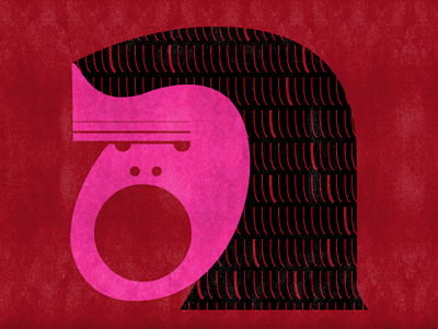
My laptop tuned to Pandora. Pixies station never disappoints:)


3 Responses
Add your comment
You must be logged in to post a comment.
Related posts


Unpredictable below IEv8—and that's just fine.
 Typeset in Museo Sans and Quatro.
© 2026 Ferocious Quarterly
Such a great series & love the very quirky, personal, unique style of illustration. Good to see really excellent work get so many props. Great interview and nice job, Scotty…keep it up!
I really like your work!!
great!!