“Straighten Up and Fly Straight”- the concert posters of Sean Cannon
 Tucked away neatly in the hollows of Aberdeen, Ohio is a little dairy bar that is aptly titled the Dairy Yum-Yum. This is not your average dairy bar, and it is. Sitting down in the red sparkle booths for even a few minutes, you are bound to run into a cast of characters that are so purely “Small Town America” that it’ll make you throw up in your mouth because you’re so excited.
If you had this little sit down anywhere between 8-20 years ago, then you probably would have been getting your peanut butter shake (which is of course to wash down the best biscuits and sausage gravy north of Dixie) served to you by little Sean Cannon. Later on, little Sean Cannon became bigger Sean Cannon and started imbuing his sense of the simple life into a scene that wasn’t quite sure what to do with it: hardcore music.
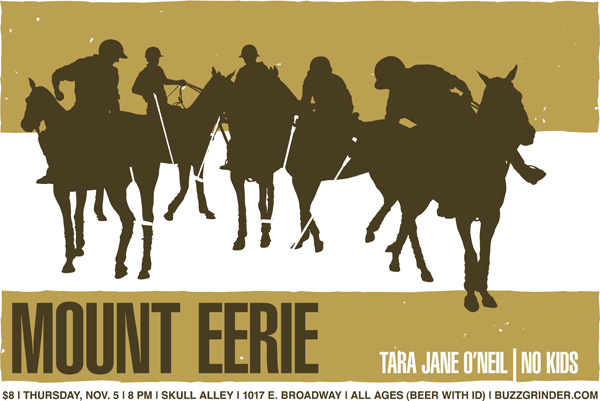
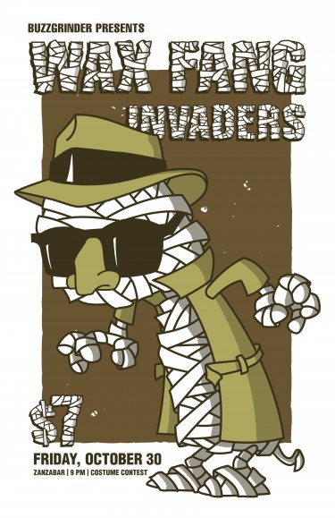
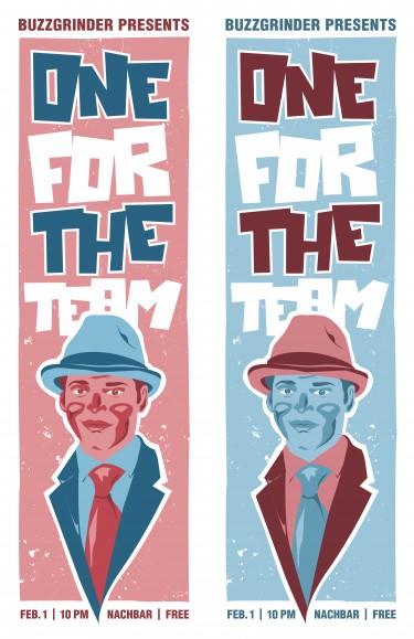
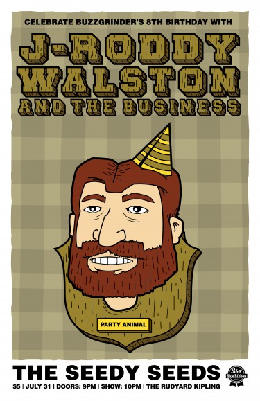
Over the years, as the editor-in-chief of the great Buzzgrinder nation Sean has been craftily dishing dirt and dripping snark all over the internet’s worst offenders. On the other hand, Sean also has been self-promoting a number of great concerts in the midwest and creating some of the coolest poster designs I’ve ever seen.
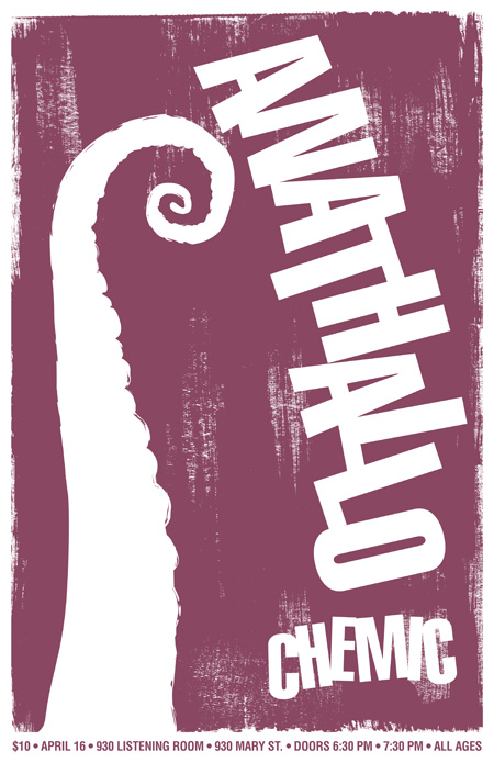
There have been some trends in recent years to make art that looks like it was commissioned for the next Wes Anderson movie (which is art I probably will like), but there is definitely a desire in me to see artwork that is singular in vision, subtle in execution, and free from the twentysomething ennui that I cannot get away from. Sean’s work is just this. I like to compare Sean’s posters to Woody Allen movies (I once did a series of much-hated posts about Allen on Buzzgrinder). Woody Allen basically made the same movie every single year since 1968. This is why most people hate him. This is also why I think he is THE greatest American film auteur. He wasn’t trying to reinvent every genre (Scorcese making a horror movie?? Puhleeez!), and he wasn’t trying to prove how good he was at everything. He just knew the type of movie he wanted to make and he made it. This may seem like a cop-out, but the true depth and scope of his oeuvre can only really be seen when you take the entire collection into consideration. When you take a step back, you can see how truly magical The Purple Rose of Cairo is, and how pitch-perfect Husbands and Wives is. When you take a similar step back, you can see the comic perfection of Sean Cannon’s “Party Animal” and the sly simplicity of the the octopus tentacle that makes an appearance in the Anathllo poster.
This is one guy who knows what the poster he wants to make and makes it great every single time. Also, it doesn’t hurt that he’s making posters for some of the best bands in the US.



Add your comment
You must be logged in to post a comment.