The Dust Settles — Seattle’s Best Coffee Logo

A few weeks ago, the blogosphere exploded when the new Seattle’s Best logo was released. Most reactions were polarized toward loving it or hating it. A few in the middle expressed acceptance of the logo, but admitted that something about it was off—something difficult to explain was missing. Now that the dust has settled, I thought I’d put some of my thoughts in writing.
The art direction, by Cina Associates, is spot on — modern, clean, bright and uncomplicated. As the SBC website states, “we needed a new look to match our optimistic outlook and simplified approach to great coffee experiences.” Likewise, the Cina Associates website adds this: “Our main concern was to show coffee in a different light, something beyond the shadow [of] Starbucks or Caribou brands.” They’ve done it, and they’ve used restraint and simple geometric forms that pay homage to many of the mid-century logos by greats like Paul Rand and Saul Bass. I admire this work quite a bit. In our era where there’s always pressure to complicate things, it’s nice to see a national brand embrace such a timeless, elegant aesthetic.
Some have said this simplicity pushes the company into the realm of ‘generic brand styling.’ I disagree. The only generic brand I can relate this too would be Target’s Up & Up brand, which is actually very nicely designed. Up & Up is an example of how good design can actually raise the perception of a so-called generic brand’s quality. At any rate, we have to see what the yet-to-be rolled out SBC packaging and design looks like as a whole before we can categorically say it looks generic. More on that in a minute.
Critique
 That droplet, encased in red, does conjure up a blood bank. It’s hard to avoid that connotation. I also feel the logo maintains an odd balance with the word coffee being flush left. I actually like this tension, but I don’t quite understand it. Interestingly, on the SBC website, they display the logo leaning slightly to the left, as if to say ‘yes, it’s heavy on the left side and we like it that way—deal with it.’ Right on.
Gotham was a good choice, though there’s a side of me that feels Gotham is getting overused these days. However, the font has truly become what it was (partially) intended to be — a replacement to Helvetica. By those terms, it’s a typeface that is ambiguous and well-designed enough to work ell in many applications and stand the test of time. So why not use it? Of course, I still question the rounded Gotham, though. It looks mighty nice, but calls to mind the rounded typeface of Dunkin’ Donuts (another company who has really stepped into the modern, bright, clean design spectrum). This could be a none-issue, depending on how pervasive it’s used in other signage.
The Big Picture
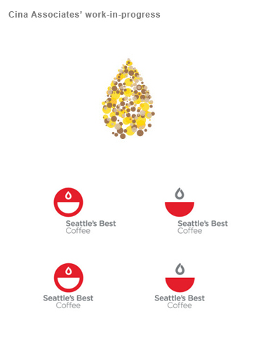
 Keep in mind that all we’ve see so far is the logo and a few images of it mocked-up on a coffee cup. There’s a lot more to be seen as SBC fully rolls out the new identity system. And that’s the catch: the new logo is part of a system and will rarely need to sell coffee by standing alone. SBC is a national brand with storefronts, packaging, POP displays, and other collateral—and we’ve yet to see what any of this will look like. Designing a logo for any company is a lengthy process that requires a lot of trial, error and consideration before arriving at solution. You can get a glimpse of this process on Cina’s website, where they show some of the stellar work-in-progress, including a custom typeface. However that process played out, the design Cina and SBC likely chose solution that best takes all these elements into consideration.
The Seattle’s Best Coffee website states that “over the next months and years, we plan to show up in new ways and different places.” What will that look like? I don’t know about you, but I’m excited to see it unfold. Here’s a company that has chosen to identify itself with clean geometric shapes, a smart font like Gotham and an obvious dedication to simple, restrained modern style. There’s a huge potential for beautiful packaging and signage. What about interior design? Will we see appropriately simple furnishing, dramatic lighting, glass and metal inside immersive, warm coffee shops nestled inside Borders and other places? I hope so.
In any case, we’ll see how well the new logo stands up once it is seen in the context of the overall design strategy it represents.
———-
Ferocious Chime-in
The Ferocious blog team to chime in with their thoughts. As you can see, we run the gamut of love and hate here, too.
“Initial reaction: a little sad to miss the warm, old school vibe that the crest/label logo had. The condensed serif font, stylized tone-on-tone shadow lines, multiple borders.. ie “getting’ a little nutty in the appearance tab”… and with all that said—I missed it the second I saw the new one.
The new logo seemed like it was trying a little hard to be that hip, Gotham Rounded, less is more, iconic mark that pulls my heart strings in the same way great contemporary typography from the 50s and 60s does. But it didn’t. I love the simplicity. I love the simple droplet icon. But it just doesn’t connect for me. To be honest, some of my favs were in Cina’s outtakes. The outlined droplet with the type outside the mark and even the custom typeface. I can get behind it though. I think it’s a great departure even if I’m not sold 100%. And it works really well on the cup…so there’s that.”
–Nate Utesch
“Yes, I DO like the new Seattle’s Best logo. “Brevity is the soul of wit,” as well attractive corporate logos, it seems. I’m very interested in minimalism at the moment and the new logo is much more eye-catching and attractive. I don’t have anything technical or text-book-y to support my opinion, but I guess what it boils down to is, “It’s purty.”
– Matt Beers
“I like it. The old one looks too much like a “warm, happy” contemporary version of a 1970s over-drawn logo. The new one is cleaner, but still has a bit of the retro “We Love Helvetica” feel to it. On the negative: it looks slightly like an 1970’s oil company logo.”
– Jeremy McFarren
“Do I like the new logo? I really really want to. While I love the simplicity of the new logo, it fails to instill me with caffeiney warmth. It feels more like airport signage. Informative and quick. That said, I really really wanna like it, dangit.”
– Jason Roemer
“My not-so-humble opinion: Since when did ‘hip’ and ‘modern’ translate into ‘innocuous’?”
– Scott
“Big step backwards though.”
– Sankofa
“I’m not into it. It looks nice but makes me think that I’m going to run out of coffee. The droplet, the half empty cup. Gives me anxiety, i’m out.”
– Ty Brinneman
6 Responses
Add your comment
You must be logged in to post a comment.


While I don’t do this often, I stand behind my comments.
I also really like the outtake under the mass of circles, first row on the right. I like that it is less concentric and the type is more asymmetrical with the logo.
cute..
I hate the new ‘Watermelon’ logo. At first, I thought it was a joke – a ‘stunt’ designed to promote the name – a little like “New Coke” in the 80’s – after which they could revert to a more classic logo scheme. I’ve noticed that not many of the Seattle’s Best store/locations have updated. Notably in SeaTac airport’s South terminal. If I were them, I would not adopt the new logo… kicking-and-screaming may be needed.
The new logo appears to have been done by a graphic’s design neophyte – more the work of an apprentice, or summer intern than of a professional graphics house. IMHO
I’m curious… did the same graphics people do the new ‘text-less’ Starbucks logo?
Let’s hope this isn’t the first in a number of mis-steps by the company. I would hate to see them end up like their one-time nemesis Atlantic and Pacific Tea Company (i.e. A&P).
And as for the cup-of-blood logo for Seattle’ Best…
That was my other first impression: If I saw someone with a coffee cup with this logo, I would ask: Is that coffee “Type A”, or “Type O”?
I’d understand how this logo would be rejected. Coz like you said, it’s simple..and it’s different. Different always takes time to get used to.
Whether or not it will be an effective branding approach depends on how they will use it and what the surrounding imagery will be like. Because when it comes down to it, it’s a well designed logo that will set them apart from the rest. Whether in a good way..is another story.